


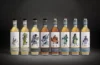

Whyte & Mackay verpasst seinen eigenen Marken ein neues Design, um ihnen ein anspruchsvolleres Image zu geben. Die Maßnahmen betreffen fünf Blends aus der gleichnamigen Whyte & Mackay Produktpalette und einen Blend mit dem Namen „Prize“, der im Oktober auf den Markt gebracht wird. Die Verpackungen werden neu gestaltet und die Flaschenform orientiert sich an einem historischen Whyte & Mackay Design von 1844. Zusätzlich werden die 12-, 18- und 21-jährigen Whiskies durch 13-, 19- und 22-jährige ersetzt.
Whyte & Mackay revamps iconic Scotch whisky
LONDON – Whyte & Mackay is relaunching its flagship whisky brand as it seeks to give it a more upmarket feel.
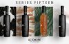
The rebrand will take in the five blends that comprise the eponymous Whyte & Mackay portfolio as well as a blended malt, called Prize, which is being launched in October.
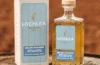
Whyte & Mackay’s blue packaging has been replaced by a metallic red-and-black look, while its prestige range will use metallic silver and gold cartons.
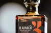
The shape of its bottles has reverted to an historic Whyte & Mackay design, originally introduced in 1844.
A red logo featuring two lions, representing the Lion Rampant symbol of Scotland and the MacGregor/Whyte Clan, has also been reintroduced. The design is intended to emulate the work of Scottish architect, artist and designer Charles Rennie Mackintosh.
The redesign, which was carried out in-house and will be rolled out over the next few weeks, will be backed by ads targeting the drinks trade and consumer PR activity.
The activity follows Whyte & Mackay’s relaunch of its Isle of Jura whisky and Vladivar vodka. Its Dalmore and Glayva whisky brands will also be revamped by the end of the year, according to a spokeswoman.
In addition, Whyte & Mackay is replacing its 12-, 18- and 21-year-old whiskies with 13-, 19- and 22-year old offerings…